Switch to the Eighties Theme
It was time to make some improvements to my blog. I worked on the pages to make them more accessible. The pages created from the posts on my grandparents, uncles and aunts are now almost complete. Biene’s family still needs to be done. The German part of the menu has been revamped to allow readers to locate articles more quickly.
I hope that you like the new look and I would appreciate to receive your feedback on the changes I have made. Have a great week!

I find it easier to find things now, so I am pro! 🙂
LikeLiked by 1 person
I like the white background and the font. The menu is great—but I wonder how many people will not know how to find it. Is there a way you can label is at “Table of Contents” or something? I fear people will not know what the box on the upper left means. Or maybe it was just that I didn’t know and had to click around to try and find the categories. Overall, I do like the look!
LikeLiked by 2 people
Oh, thank you very much, Amy! Your comment is a find an example for constructive criticism. It is too bad that the wordpress themes are not more flexible. Perhaps I can insert something on the header image to indicate where the menu is located.
LikeLiked by 1 person
That makes sense. Good luck!
LikeLiked by 1 person
Like Amy I like the new look, but had similar issues with navigation Peter. I agree that WP isn’t particularly flexible, but hopefully you can find a solution
LikeLiked by 2 people
As I mentioned to other bloggers the menu icon should have its name underneath in small print. I could perhaps insert the name onto the landscape picture. Thank you, Su! Your comments are always appreciated.
LikeLiked by 1 person
Thanks Peter. I’ll look now.
LikeLiked by 1 person
Looks good to me! 🙂
LikeLiked by 1 person
Thank you, Pit! Any problem finding the menu button?
LikeLiked by 1 person
No, not at all. I knew what it looks like from other blogs. What I didn’t know was what the button on the top right was for.
LikeLiked by 1 person
The widgets are hidden behind the button on the right. Normally they clutter up the posts and take space away from what is most important, i.e. the post. That was one of the reasons why I chose this theme. Thank you!
LikeLike
Thanks, Peter. I had already found them. Your blog, uncluttered and simple in its layout as it is, looks great. I myself can never get to such a design as I want ALL the widgets and buttons show up all the time. Which, in turn, makes for a lot of clutter. I’ve often been thinking of s=choosing a different theme, but have never been able to make up my ind.
LikeLiked by 1 person
I tried to insert the word menu to the image next to the icon, but I have no control over where it will show up on the various devices people use. So I hope most people will know from past experiences what the two icons mean. Thank you, Pit, for your valuable comment!
LikeLike
“. So I hope most people will know from past experiences what the two icons mean.”
Or, just like I did, simply click on them and find out. Once again: I like the simplicity of your new design.
LikeLike
Good job, Peter! Everything looks great — even the menu and the calendar search! But I think you may have started something. I have been using the same theme for almost ten years now and it’s probably time for me to make some changes, too!
LikeLiked by 1 person
Every once in a while we need to make changes – hopefully for the better. A woman often wants a new dress, even though her wardrobe is overflowing. So why not make changes to the virtual appearance of our blog? You may want to try the Libre-2 theme. Best wishes! Peter
LikeLike
Switch to the Eighties Theme
New Look for Klopp Family Blog
LikeLiked by 1 person
Loving these changes, Peter, keep going, it looks great.
LikeLiked by 2 people
I am so happy to read that you like the changes, Cornelia.
LikeLike
Peter, your new theme is attractive and easy to read with the black print on the white background. It did take a little bitbof searching to find the table of contents. However, i had seen the menu on the upper left on other blogs that was also not labeled. I agree with the previous comments that WordPress is not flexible. Congratulations on the new theme.
LikeLiked by 1 person
The menu icon should have its name attached to it. The good part is that the icon reduces clutter, especially if there are lots of menu items like on my blog. Thank you, Hazel, for your kind words. Best wishes! Peter
LikeLiked by 1 person
You are welcome, Peter!
LikeLiked by 1 person
That looks quite fresh! Well done!
I’m eager to read also about Biene’s family.
LikeLiked by 1 person
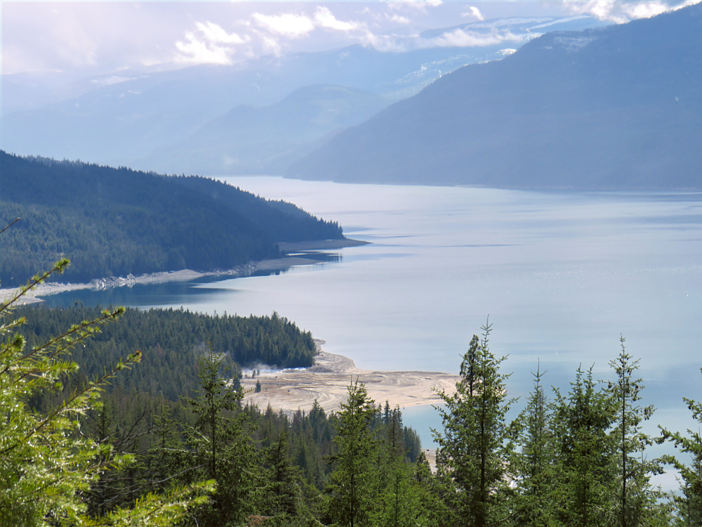
Very nice, Peter. My glance is captivated by your photos. The image you kindly provided made me feel as a bird soaring in the skies. So beautiful and what a way to start the day
LikeLiked by 1 person
Thank you, Luda! I am so glad your heart is soaring looking at the header photo of the new theme.
LikeLiked by 1 person
love it!
LikeLiked by 1 person
What a gorgeous photo! (Makes me wish I could travel, but obviously that’s something that will have to happen in the future.) And I like the new format for your blog! Good for you for taking the time to reorganize it. I haven’t updated mine in over four years, so maybe I need to think about that too!
LikeLiked by 1 person
Thank you for the encouraging comment, Ann!
LikeLiked by 1 person
I noticed the new look as soon as I reached yr blog. And then I reached this post. Great idea Peter. I think a periodic ‘review and refresh’ is a welcome idea.
LikeLiked by 1 person
BTW, if you are OK sharing, what service do you use for hosting yr blog and what tool do you use for designing it? I ask because I am thinking of moving my blog to a personal domain.
LikeLiked by 1 person
I use wordpress like you do. By paying an annual fee, the word WordPress disappears from your URL. You also have free access to a great number of professional themes, which you can change anytime. Of course, the extra features will cost you about $100. If you can afford it, it’s worth it. Have a great day, Ankur!
LikeLike
Looks great!
LikeLiked by 1 person